Thursday, 6 December 2012

Final Design Project

It took me quite a while to figure out what I wanted to do for the final artwork project, even though I had these ideas of how I want my artwork to look like. However, when I started editing my sketches on Photoshop, I realized that I wasn't able to make it look like how I originally wanted it to be. So, I changed my idea/sketch, quite a number of a times. In the end, I decided on this:

 I started off with a sketch of a girl dressed in tattered clothes. I originally intended her to be a puppet, as a symbolization of the child being controlled by labour forces.

 Next, I applied a layer of paint splatters over the child and I layer masked the paint splatters onto the girl.

After that, I photoshopped rope onto the girl to make it look like she was hanging like the controlled puppet she was. I also coloured the background black and added dripping paint to the girl's body, to make it seem as if she was in pain, and the colour from her body (her energy, her spirits) was slowing fading away.

 I inserted a picture of wood and I used the transform tool to give the wood a bit more perspective.

 I hid all the layers of the girl and the wood, and I concentrated on the background. I made some shapes and filled them in with different solid colours and gradients.

 I used the filter tool to spherize the background and I added another similar sketch of the girl. The colourful shapes represent the head of a man that is about to engulf the girl. I also used the filter tool to twist the girl to make it look like she was about to be sucked, and I added eyebrows and a bright green eye to the man.

 I duplicated the layers of the paint-splattered girl and I twisted them to make the mouth of the man to make it seem like he was sucking the girl into his world. It also symbolizes that the girl had no control over her
body and her life.

The last duplicated image of the paint-splattered girl was not twisted as much as the others. It was added to the mouth of the man to show that part of her has already been sucked into the vortex, and that she was going to lose complete control over her life.

 I then decided to mix both parts of the artwork together. I made the wood layer visible to show that it's leading towards the inside of the man's mouth.


Finally, I made the layers of the puppet girl visible.

This was the final artpiece:


Wednesday, 5 December 2012

Sketches

We were asked to come up with 5 different ideas for our final artwork project, and these were the 5 that I came up with:

 This was the first sketch I came up with. I wanted it to depict the emotional abuse of a person. However, it didn't quite work out as nice as I expected on Photoshop, so I quickly tried other ideas. 

This was supposed to be the drawing of a child's feet, depicting child labour. The child is wearing a boot that is too big for it. Another boot is missing, indicating that these children are not properly treated. 

 I came across the idea of a broken teddy bear, but I decided that it was a bit too common and mainstream.

 After that, I had this idea of a girl being controlled by a puppet master, to show that the child is not at her own free will to do whatever she wants; she is being exploited. However, I wasn't very happy with the drawing of the girl because she somehow looks a little bit like a doll.

 In the end, I decided on a more realistic (I hope) of a girl being hung like a puppet. This became the final sketch for my final artwork project.

Wednesday, 7 November 2012

sketch digital painting

One of our tutorial practices was to take a sketch, and then transform it into a painting using Photoshop. After a certain amount of dilemma and consideration, I decided to go with a sketch of this lion:


And after a lot of layers and shading and colouring and blending the colours together using the smudge tool, this is what I came up with:


And this is how it looked like after I tried the "oil painting" filter: 


Saturday, 3 November 2012

national visual arts gallery trip

During our class trip to the National Visual Arts Gallery, I saw many different paintings and sculptures that were all unique and really gorgeous. Out of all the different pieces of art that I saw, I loved the ones that were painted in detail, painted with realistic depiction, as well as the ones with vibrant bright colours.

There was one particular painting that captured my attention. It was an abstract painting of the face of a woman, painted in colours such as red, yellow, orange, green, blue and purple. The left side of her face is covered with dripping colours of red, yellow and orange. The right side of her face has a mixture of green, blue and purple, also dripping down from her forehead. The painting is called Tabah Seorang Wanita by Dato' Mahsun Haji Taib. 

I think the name of the painting already very accurately depicts the painting itself. The strong colours of red, yellow and orange show the tough challenges that a woman has to face: carrying a child, carrying out the duties of a mother, having to face discrimination by the general public and all. The bright colours also show how she has to stand her ground to face all these challenges. On the other hand, the colder colours of green, blue and purple show the sorrow of having to face these tough challenges. I believe the colours represent all the negative emotion that she feels: being hurt, upset, sadness, insecurity, frustration and maybe even slight depression. The fact that only one side of her face is covered with purple, green and blue shows that she probably hides her negative emotion. On the outside, she braves her challenges, but on the inside, she is breaking apart.

Thursday, 1 November 2012

surreal representation of the mind artwork

 Step 1.

 Step 2.

 Step 3.

 Step 4.

 Step 5.

Step 6.

 Step 7.

 Step 8.

  Step 9.

Final step!

  The latest and currently the most complex photoshop artwork we made in class. There are a few bits and pieces that are a bit rough, like the left side of the lady's face, as well as the flying book on top of her head. I really liked how different textures were used that added to the background, as well as the different exposure levels and the brightness. It made such a difference to the picture and it made the picture look more real.

Wednesday, 31 October 2012

colourful light burst text effect

Based on a photoshop tutorial, we learnt how to apply different styles of filters on pictures as well as on font! It's really cool, and I felt like I learnt quite a lot from this. Hopefully I'll be able to remember the steps and reciprocate if I ever need/want to!


The light burst text effect was put together with a black and white photo, which I tweaked by playing around with the filter tab in Photoshop. I really loved the pictures of night sceneries of Paris, which is why I chose a picture of the Eiffel Tower, and I thought that pink and yellow would bring out the night colours and night life of Paris! :)

research on art movement

Out of the many art movements that were introduced in class, I think my favourites (or the ones that really captured my eye, and the ones that I could really understand) were expressionism and impressionism.

Expressionism is actually quite a modern art movement, only originating at the beginning of the 20th century. The goal or the objective of this art movement is actually to present the picture in a subjective perspective. Artists usually distort the picture a little bit to give it a more dramatic effect. Of course, this art movement is not just in paintings, it also reaches out to architecture, literature, theatre, film, dance as well as music!


(source) 
Van Gogh's Starry Night was one of the most famous expressionism paintings. The swirls in the sky represent the breeze of the night, and the bright balls of white and yellow are the stars in the sky, shining over the village below. I especially love Van Gogh's small, short strokes in his painting :)

(source)
The Kiss by Gustav Klimt. I'm not quite sure if this is expressionism, but a few sites that I've Googled said so. It is also a mixture of other art movements, such as Art Noveau. This painting tells the story of two lovers who are embraced in a very tight hug, with the man leaning in on the woman to kiss her cheek. I love this painting not because of the romantic aspect of it, but also because Klimt was very detailed in painting the clothes of the lovers as well as the green garden patch they're kneeling on.

Impressionism is an art movement that originated in Paris. What I love a lot about impressionism is the small, thin brush strokes that very accurately capture the essence and detail of the paintings. Movement is a really important aspect in impressionism as well as unusual visual angles. The name "impressionism" actually came from Claude Monet's painting Impression.

 (source)
Impression by Claude Monet. I love the single orange sun in the sky and its reflection in the water. 

Dance at Le Moulin de la Galette by Pierre-Auguste Renoir. This is one of my absolute favourites. I love how Renior painted the expressions and movements of each and every person in this picture, as well as the light and shadow on their faces. It gives a very good sense that the people in this picture are enjoying themselves at a garden party under the cool shade of trees. You could just form a story by looking at the people's faces :)

Friday, 19 October 2012

field trip to central market area

Last Wednesday, instead of having the usual tutorial class learning photoshop in a computer lab, the entire class went out to Pasar Seni for a field trip. It wasn't like I have never been there before, but going there on a class trip just seemed a lot more exciting than going there to shop for items. It was a chance for us to pretend to be tourists and take pictures a plenty. Which I did! :)

This graffiti really caught my eye in the sense that this woman seems to be a mixture of certain elements. She looks like a plain woman by the looks of her dressing, but her hairstyle could suggest that she used to be a woman of grace and elegance. The two round spots on her cheek could also suggest makeup during her elegant days, & the drips from her eyes and makeup might show that something happened to her that forced her from a life of riches to a life of poverty.

I see these stamps everywhere, and I thought that whoever made this was trying to send a message that the person exists and wants to stand out among all the talented graffiti artists around the area.

This building was interesting to me because the yellows doors and windows all show a sense of unity, something a bit rare around the area seeing as Pasar Seni is a mix of cultures and art.

The row of grafitti that can be seen at the far end of the sewer drain.

One of my favourites. I think the artist has a really cool sense of the KL style. To me, it sends a message that KL is not what it seems, and the meaning of the city can look different to tourists and to citizens who have lived long enough to truly know KL for what it is. 

Just a random piece of architecture that we were hanging around, near the Pasar Seni LRT station. I really loved the angle from where I was standing, so I snapped a picture of it. 

The vibrant and bright colours of the graffiti along the sewer drain. 

I thought it was interesting how a Malaysian flag was just standing there flying in the wind beside this tall, huge building with amazing architecture style. I just had to zoom in and capture the view.

Trying out my colour accent feature in my camera, teehee. 

I think picture very nicely highlights the LRT pulling into the station as well as the row of graffiti below the station.

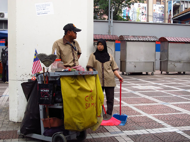
Two very important workers of the city; without them, the city would not be clean. I also thought it very interesting that two Malaysian flags are stuck by the cart- a good display of patriotism. 

A really gorgeous lamp hanging from the ceiling of Pasar Seni. 

A bright display of I <3 KL t-shirts hanging in a row. If there were more colours, then the picture might have looked nicer.

A mak cik printing t-shirts in one of the shops in Pasar Seni.

The hand bracelets that we bought from one of the small stalls in Pasar Seni.


More display of graffiti. I like how there are tall buildings in the background- it sums up the flowing river nicely (even though the river could use a good cleaning).

Our design class!

More graffiti. 

A small graffiti showing the 55th year of Malaysian independence. I wonder how the artist balances the even-ness of the banner tails. Also, there is a tinier graffiti of the body of man with the head of a chicken, to the right of the 55th year graffiti. 

Cute cat, who was either stuck up there and couldn't get down, or just cautiously watching all of us walk past it. 

All in all, the row of graffiti art near the river is especially amazing; we definitely have a lot of talented Malaysians. Also, amongst all the shops in Pasar Seni itself, my favorites would definitely have to be the Arabian-Moroccan styled ones. Too bad I wasn't able to take more pictures because I don't think many of the shopkeepers would have fancied it, and they were all rather sharp-eyed.