The light burst text effect was put together with a black and white photo, which I tweaked by playing around with the filter tab in Photoshop. I really loved the pictures of night sceneries of Paris, which is why I chose a picture of the Eiffel Tower, and I thought that pink and yellow would bring out the night colours and night life of Paris! :)
Wednesday, 31 October 2012
colourful light burst text effect
Based on a photoshop tutorial, we learnt how to apply different styles of filters on pictures as well as on font! It's really cool, and I felt like I learnt quite a lot from this. Hopefully I'll be able to remember the steps and reciprocate if I ever need/want to!
research on art movement
Out of the many art movements that were introduced in class, I think my favourites (or the ones that really captured my eye, and the ones that I could really understand) were expressionism and impressionism.
Expressionism is actually quite a modern art movement, only originating at the beginning of the 20th century. The goal or the objective of this art movement is actually to present the picture in a subjective perspective. Artists usually distort the picture a little bit to give it a more dramatic effect. Of course, this art movement is not just in paintings, it also reaches out to architecture, literature, theatre, film, dance as well as music!
Expressionism is actually quite a modern art movement, only originating at the beginning of the 20th century. The goal or the objective of this art movement is actually to present the picture in a subjective perspective. Artists usually distort the picture a little bit to give it a more dramatic effect. Of course, this art movement is not just in paintings, it also reaches out to architecture, literature, theatre, film, dance as well as music!
(source)
Van Gogh's Starry Night was one of the most famous expressionism paintings. The swirls in the sky represent the breeze of the night, and the bright balls of white and yellow are the stars in the sky, shining over the village below. I especially love Van Gogh's small, short strokes in his painting :)
Van Gogh's Starry Night was one of the most famous expressionism paintings. The swirls in the sky represent the breeze of the night, and the bright balls of white and yellow are the stars in the sky, shining over the village below. I especially love Van Gogh's small, short strokes in his painting :)
(source)
The Kiss by Gustav Klimt. I'm not quite sure if this is expressionism, but a few sites that I've Googled said so. It is also a mixture of other art movements, such as Art Noveau. This painting tells the story of two lovers who are embraced in a very tight hug, with the man leaning in on the woman to kiss her cheek. I love this painting not because of the romantic aspect of it, but also because Klimt was very detailed in painting the clothes of the lovers as well as the green garden patch they're kneeling on.
The Kiss by Gustav Klimt. I'm not quite sure if this is expressionism, but a few sites that I've Googled said so. It is also a mixture of other art movements, such as Art Noveau. This painting tells the story of two lovers who are embraced in a very tight hug, with the man leaning in on the woman to kiss her cheek. I love this painting not because of the romantic aspect of it, but also because Klimt was very detailed in painting the clothes of the lovers as well as the green garden patch they're kneeling on.
Impressionism is an art movement that originated in Paris. What I love a lot about impressionism is the small, thin brush strokes that very accurately capture the essence and detail of the paintings. Movement is a really important aspect in impressionism as well as unusual visual angles. The name "impressionism" actually came from Claude Monet's painting Impression.
(source)
Impression by Claude Monet. I love the single orange sun in the sky and its reflection in the water.
Impression by Claude Monet. I love the single orange sun in the sky and its reflection in the water.
Dance at Le Moulin de la Galette by Pierre-Auguste Renoir. This is one of my absolute favourites. I love how Renior painted the expressions and movements of each and every person in this picture, as well as the light and shadow on their faces. It gives a very good sense that the people in this picture are enjoying themselves at a garden party under the cool shade of trees. You could just form a story by looking at the people's faces :)
Friday, 19 October 2012
field trip to central market area
Last Wednesday, instead of having the usual tutorial class learning photoshop in a computer lab, the entire class went out to Pasar Seni for a field trip. It wasn't like I have never been there before, but going there on a class trip just seemed a lot more exciting than going there to shop for items. It was a chance for us to pretend to be tourists and take pictures a plenty. Which I did! :)
All in all, the row of graffiti art near the river is especially amazing; we definitely have a lot of talented Malaysians. Also, amongst all the shops in Pasar Seni itself, my favorites would definitely have to be the Arabian-Moroccan styled ones. Too bad I wasn't able to take more pictures because I don't think many of the shopkeepers would have fancied it, and they were all rather sharp-eyed.
This graffiti really caught my eye in the sense that this woman seems to be a mixture of certain elements. She looks like a plain woman by the looks of her dressing, but her hairstyle could suggest that she used to be a woman of grace and elegance. The two round spots on her cheek could also suggest makeup during her elegant days, & the drips from her eyes and makeup might show that something happened to her that forced her from a life of riches to a life of poverty.
I see these stamps everywhere, and I thought that whoever made this was trying to send a message that the person exists and wants to stand out among all the talented graffiti artists around the area.
This building was interesting to me because the yellows doors and windows all show a sense of unity, something a bit rare around the area seeing as Pasar Seni is a mix of cultures and art.
The row of grafitti that can be seen at the far end of the sewer drain.
One of my favourites. I think the artist has a really cool sense of the KL style. To me, it sends a message that KL is not what it seems, and the meaning of the city can look different to tourists and to citizens who have lived long enough to truly know KL for what it is.
Just a random piece of architecture that we were hanging around, near the Pasar Seni LRT station. I really loved the angle from where I was standing, so I snapped a picture of it.
The vibrant and bright colours of the graffiti along the sewer drain.
I thought it was interesting how a Malaysian flag was just standing there flying in the wind beside this tall, huge building with amazing architecture style. I just had to zoom in and capture the view.
Trying out my colour accent feature in my camera, teehee.
I think picture very nicely highlights the LRT pulling into the station as well as the row of graffiti below the station.
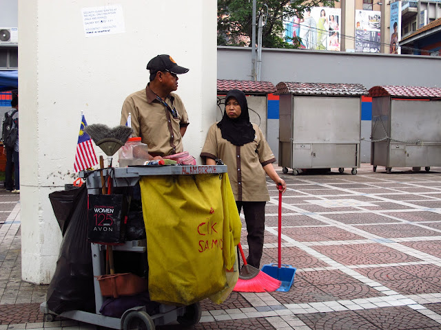
Two very important workers of the city; without them, the city would not be clean. I also thought it very interesting that two Malaysian flags are stuck by the cart- a good display of patriotism.
A really gorgeous lamp hanging from the ceiling of Pasar Seni.
A bright display of I <3 KL t-shirts hanging in a row. If there were more colours, then the picture might have looked nicer.
A mak cik printing t-shirts in one of the shops in Pasar Seni.
The hand bracelets that we bought from one of the small stalls in Pasar Seni.
More display of graffiti. I like how there are tall buildings in the background- it sums up the flowing river nicely (even though the river could use a good cleaning).
Our design class!
More graffiti.
A small graffiti showing the 55th year of Malaysian independence. I wonder how the artist balances the even-ness of the banner tails. Also, there is a tinier graffiti of the body of man with the head of a chicken, to the right of the 55th year graffiti.
Cute cat, who was either stuck up there and couldn't get down, or just cautiously watching all of us walk past it.
Thursday, 18 October 2012
research on colour
I've had a few favourite colours over the past few years, but the current colour I'm really attracted to would be turquoise.
Turquoise is actually a blue-ish tone of green, and the colour comes from the gem Turquoise. This is an example of what turquoise gems look like:
Before this, I honestly had no idea that turquoise was a type of mineral; I thought that it was just some form of a colour that someone mixed up. The above picture is one of the more natural, realistic photo of the turquoise minerals/gemstones that I could find.
The turquoise gemstones can actually change colour when mixed with other chemicals, or when it has been exposed to dust or the acidity of the skin. I believe that is where the original variations of colour of turquoise came from. What I've found is that there are 5 variations of turquoise:
Celeste.
Light turquoise.
Cyan.
Medium turquoise.
Dark turquoise.
Pearl mystique turquoise (very similar to dark turquoise but this one has more of a pearly tone)
When looking at turquoise, sometimes I feel calm, because the colour reminds me of the sea (turquoise has been used to describe the colour of the Caribbean sea!), and sometimes I feel a sense of excitement, especially when the shade of turquoise is bright and sharp enough to capture one's eye from a far corner. To me, turquoise can tell a lot more stories compared to colours like blue or red, because it is a colour that is somewhat between blue and green. It is, of course, all up to one's imagination.
Subscribe to:
Comments (Atom)


